01
Scattered websites
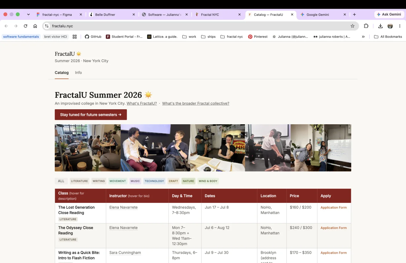
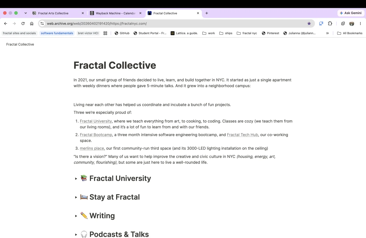
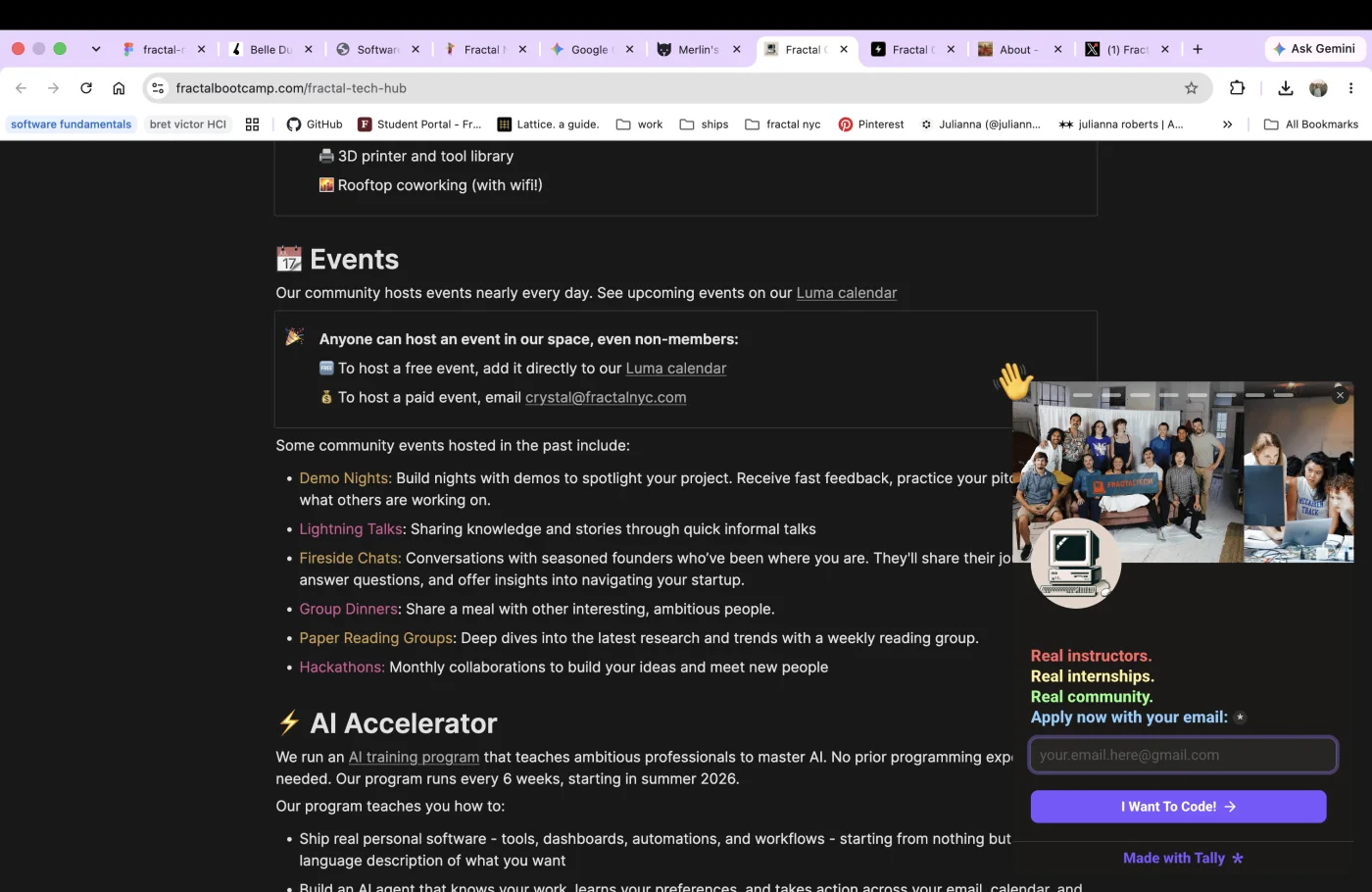
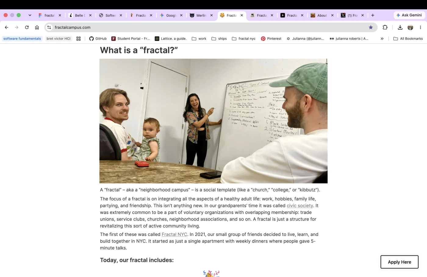
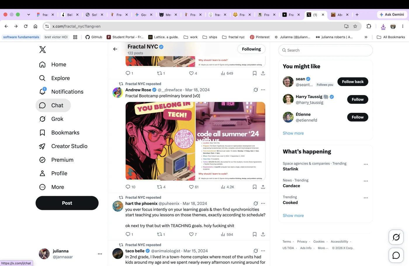
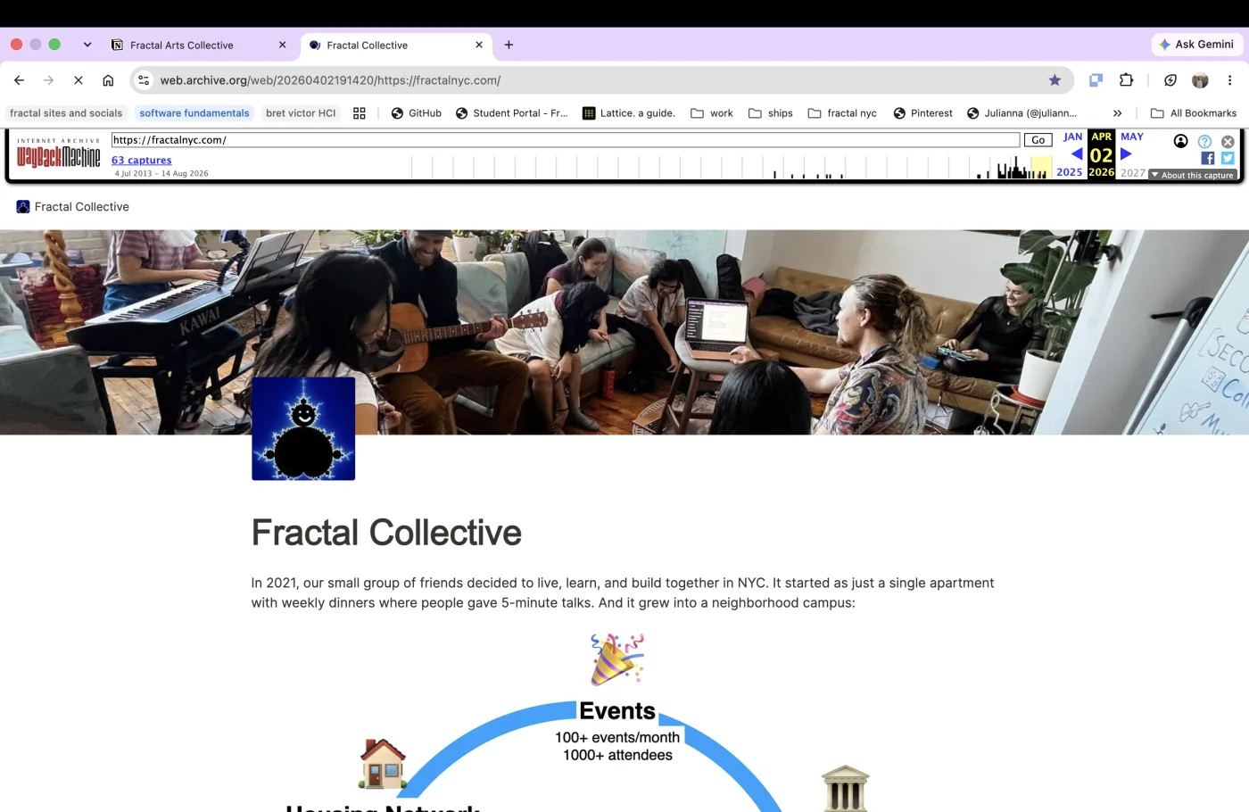
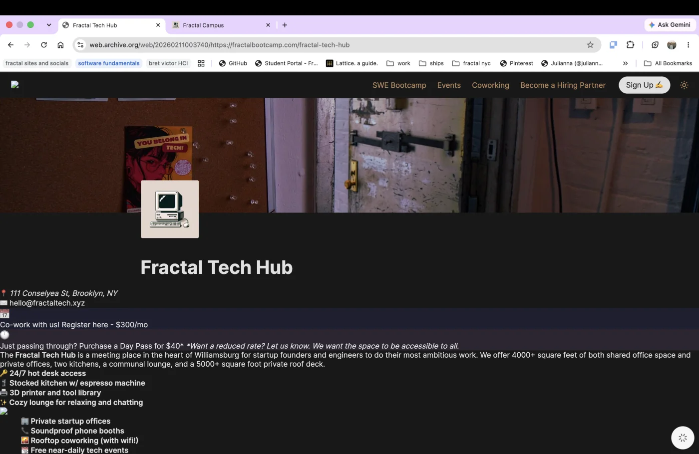
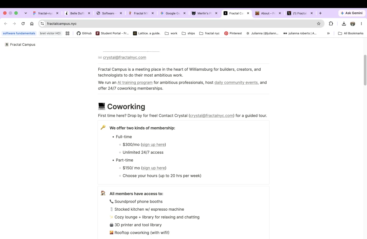
Members and prospective investors had to jump between separate sites to understand what Fractal offered. Andrew and Priya were repeatedly pulled away from their work to explain the network and route people by hand.
Fractal Collective NYC
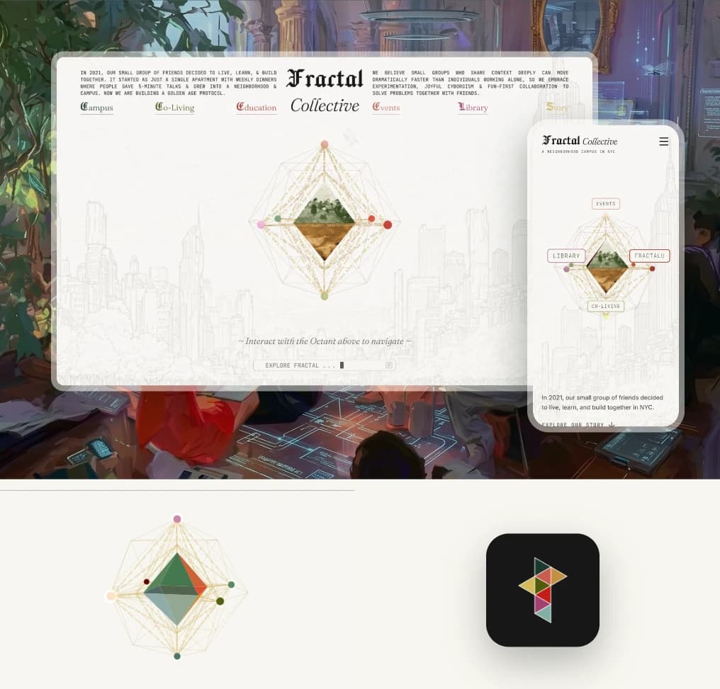
Fractal is a growing network of community-led spaces, co-living houses, education programs, and events across New York City. This branding project connected its various branches—its “houses”—through one shared identity, while leaving each enough flexibility to express its own character.
The problem
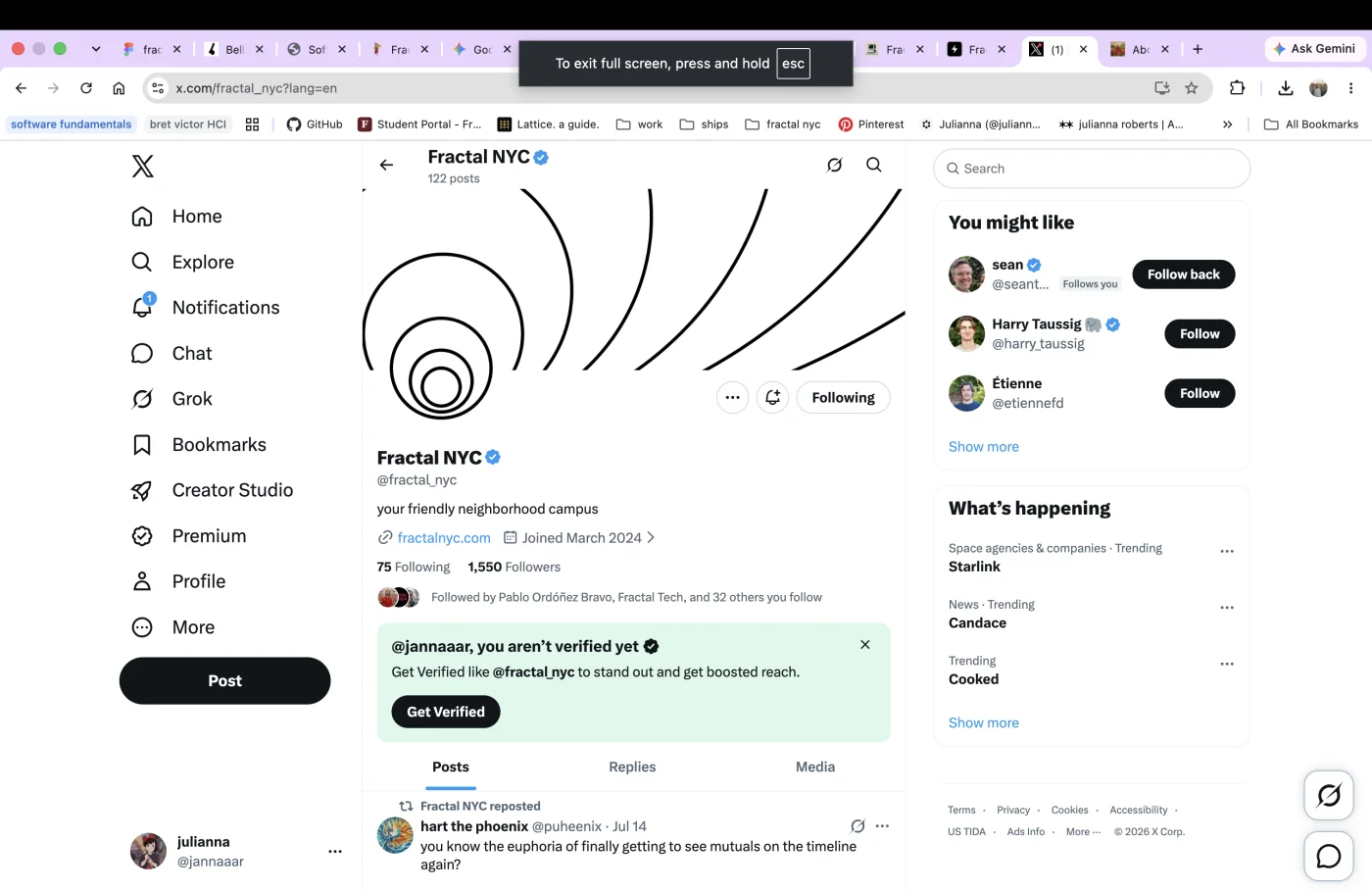
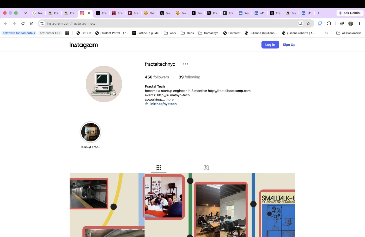
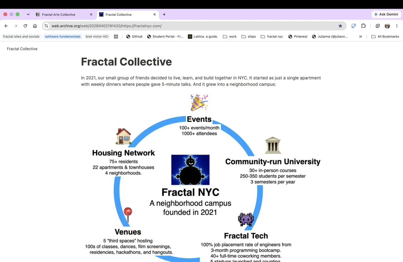
Fractal had grown faster than its digital identity. Its clubs, houses, programs, and events had each accumulated their own semi-finished, purely functional websites, built and managed by different people. Together, they made one collective look like many unrelated projects.
01
Members and prospective investors had to jump between separate sites to understand what Fractal offered. Andrew and Priya were repeatedly pulled away from their work to explain the network and route people by hand.
02
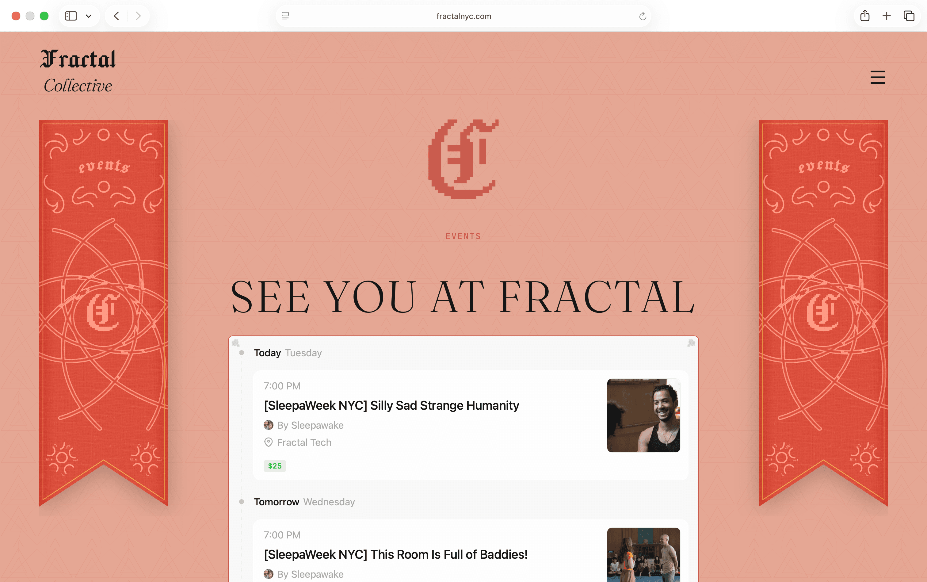
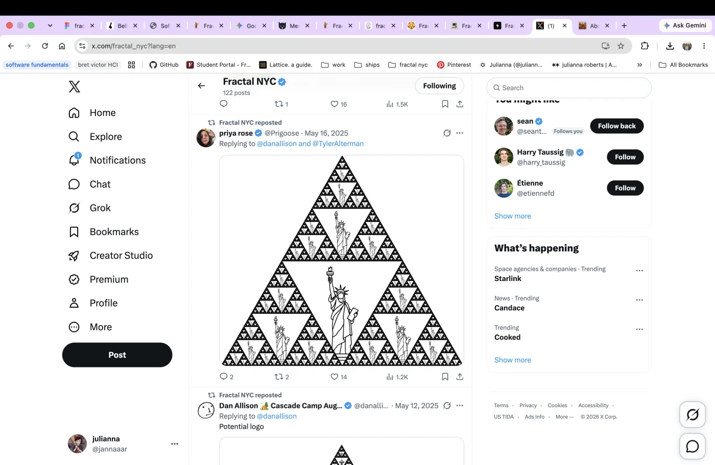
Logos, type, color, and social templates changed from account to account. Related initiatives did not look related, and every new page introduced another interpretation of Fractal.
The approach
The goal was to make the whole network legible while giving every branch a recognizable place within it. The new site would offer just enough context to lead someone to the right door—not publish every detail of life behind it.
01
I researched and collected Fractal’s scattered websites and scattered brand identity into one inventory. Seeing both forms of fragmentation together made the core problem visible.
02
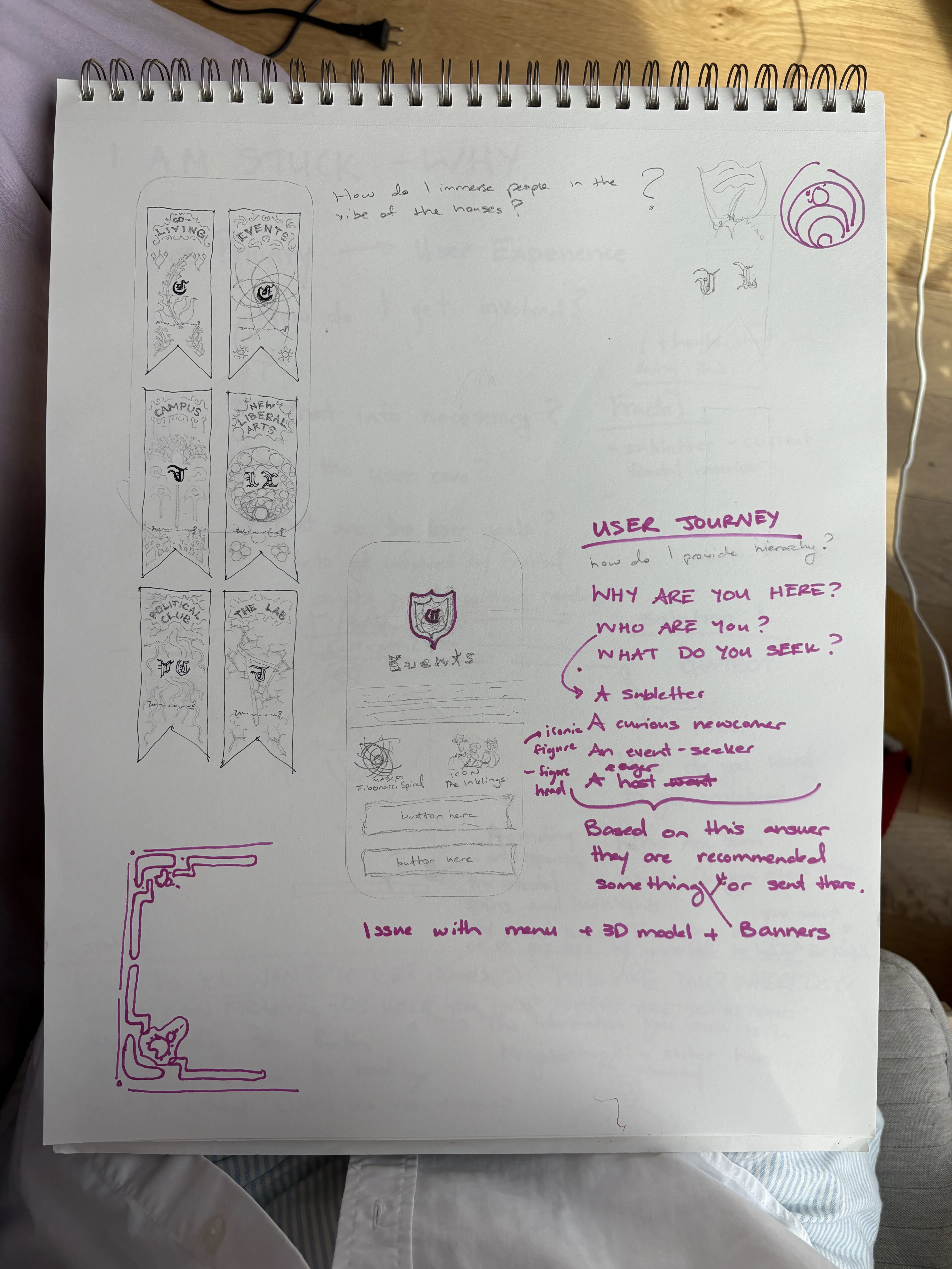
Working with Andrew and Priya, I created clearer paths around one question: “How do I get involved?” The navigation needed to offer enough context to guide people, while keeping addresses and semi-private community details behind an intentional boundary.
03
I created a shared visual language across Fractal’s houses using a common logo, typography, color, geometry, and component system. Each branch could keep its own character while remaining visibly part of one Fractal.
Defining the wayfinding
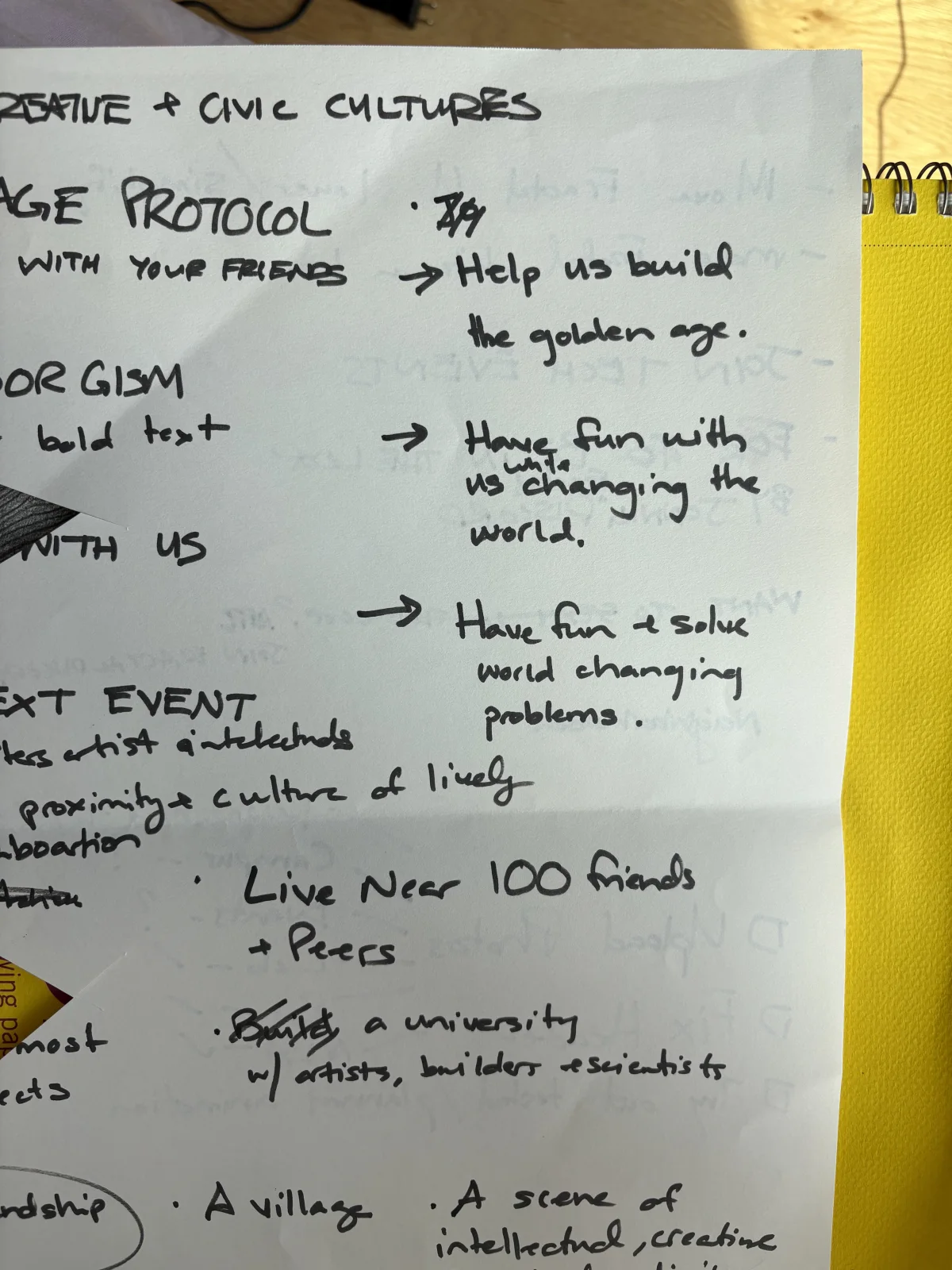
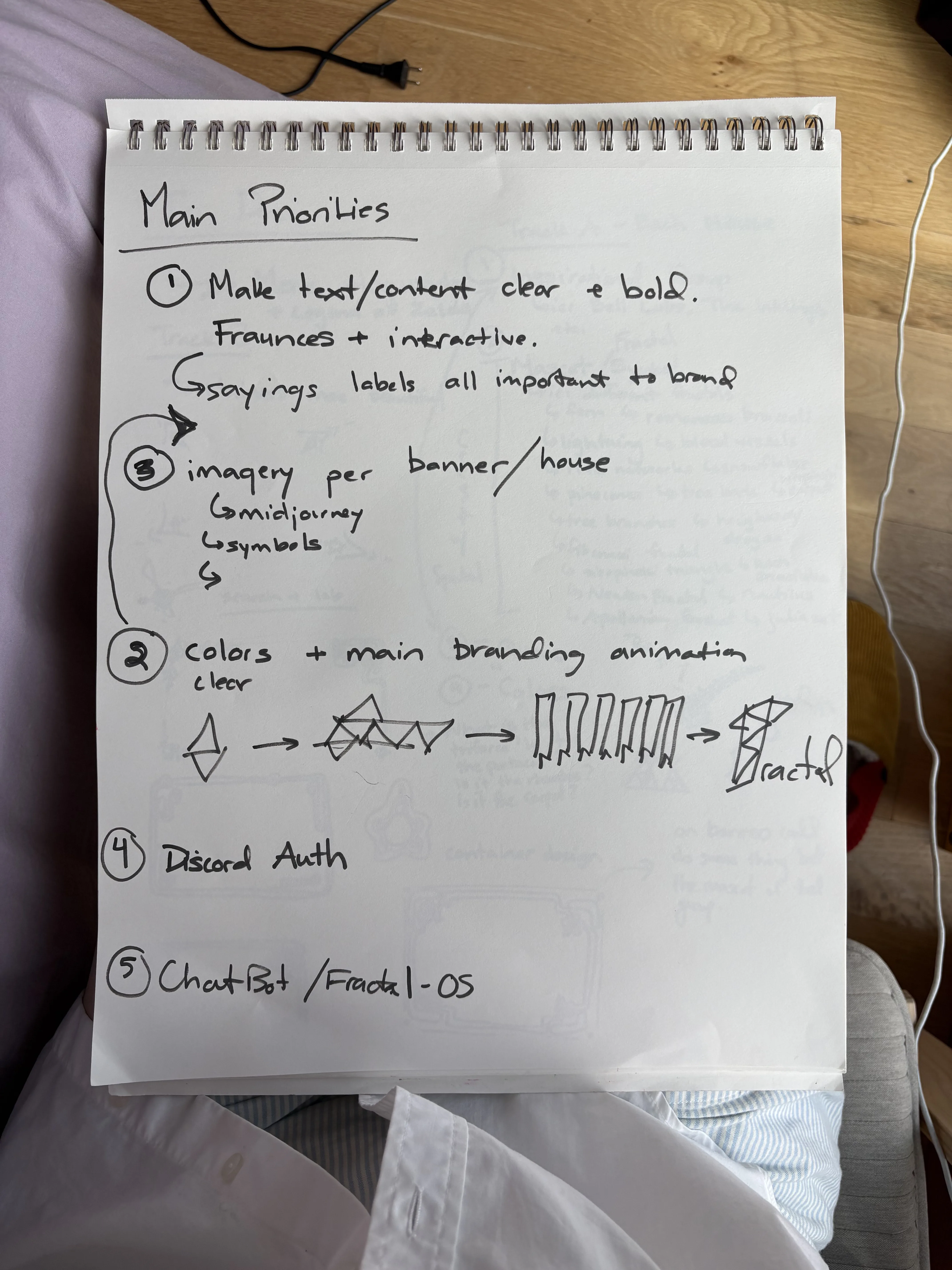
Andrew, Priya, and I explored what people needed to understand, how much the public site should reveal, and where each path should lead. We then organized Fractal into seven public-facing paths, anchored by Home, the Protocol, and Story.
Brand design
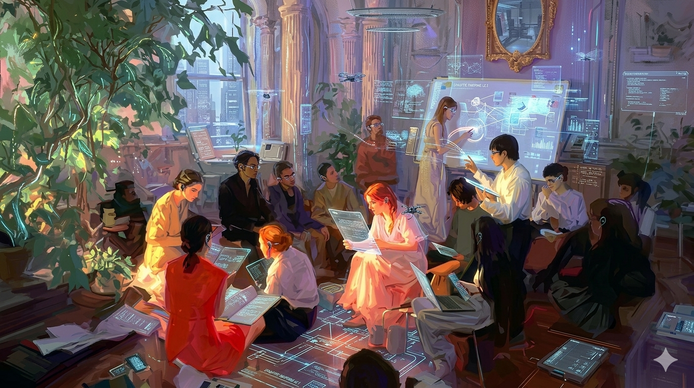
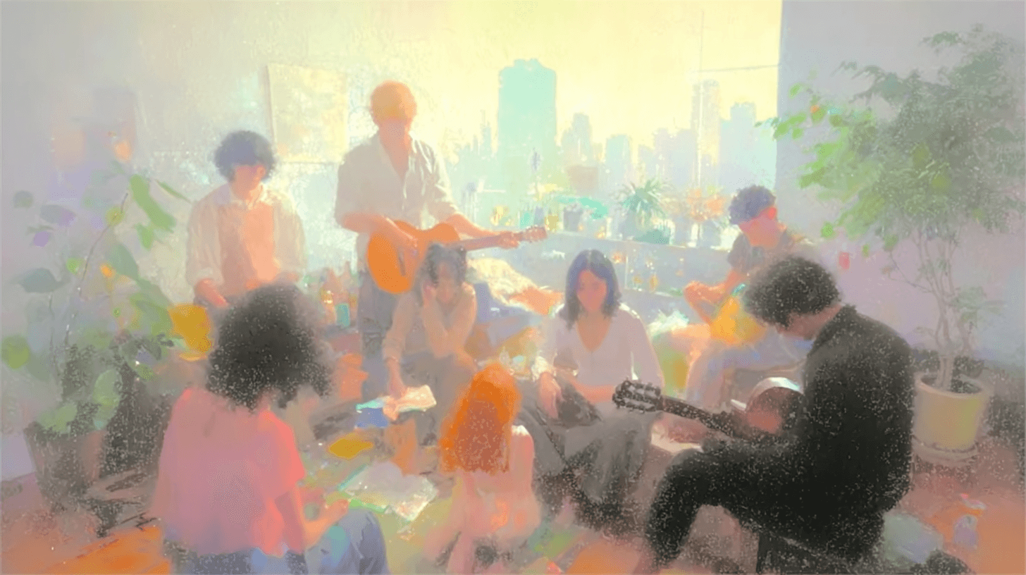
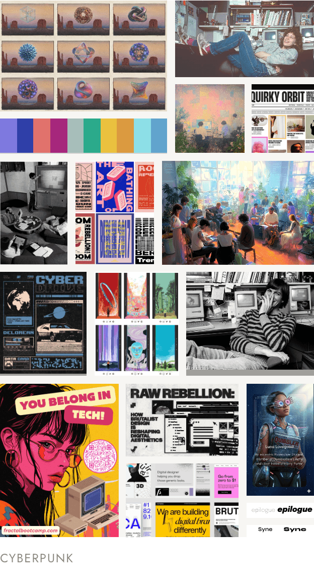
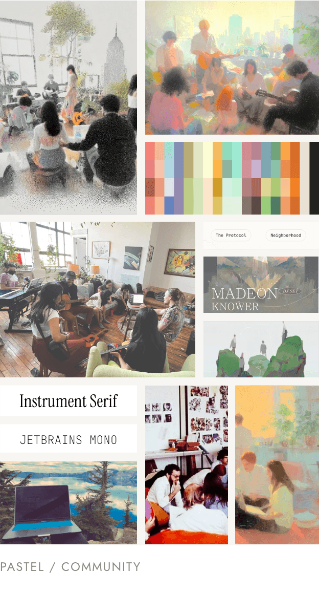
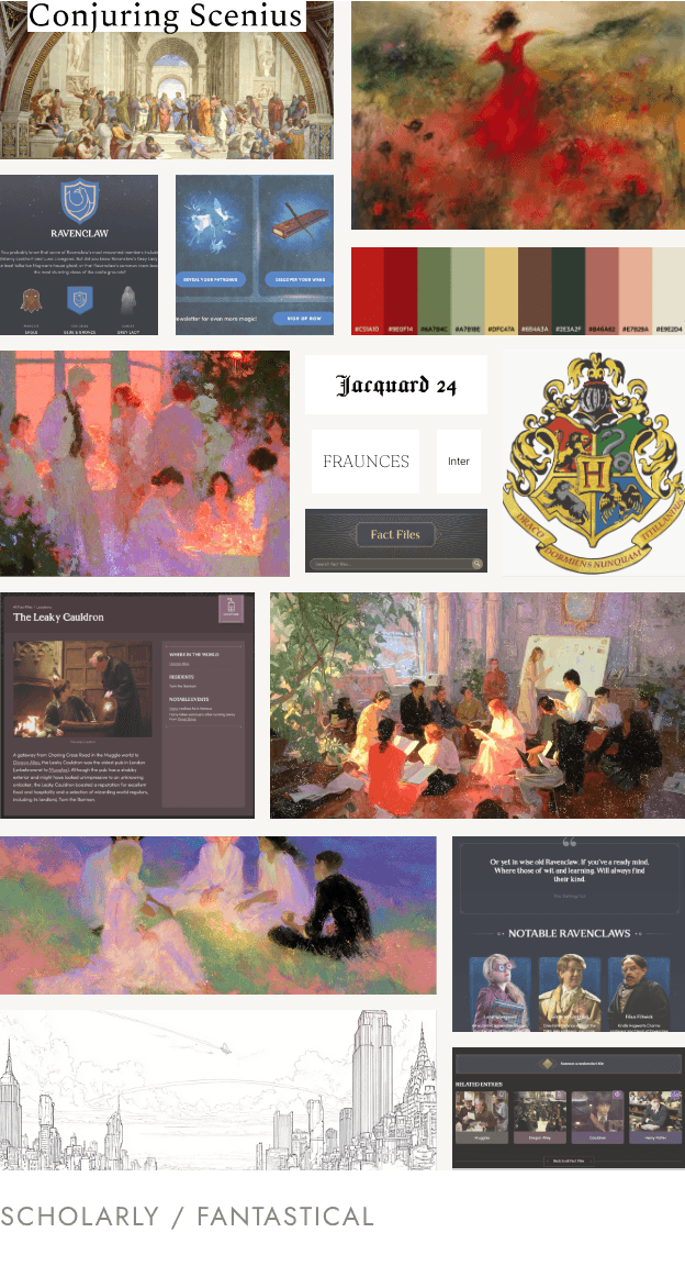
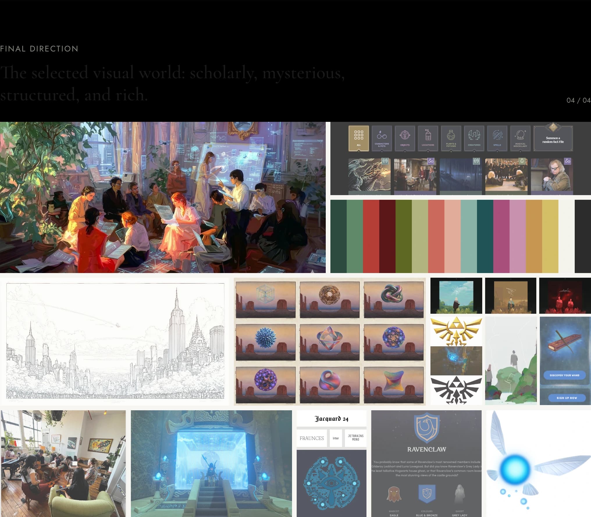
It was fun to explore Fractal’s different sides through moodboarding. Each direction could feel like Fractal on its own, but each emphasized a particular part of the network: its bright, heartwarming community; its cyberpunk computer-club core; and its love of learning, serious knowledge work, and an almost magical, Hogwarts-like sense of scholarship. The final direction weaves them together through a whimsical, almost game-like futurism—a tech-futurist Hogwarts that balances progressive optimism with Fractal’s scholarly, deeply nerdy character.
Wayfinding
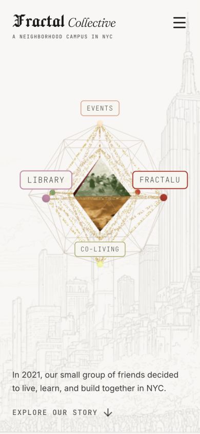
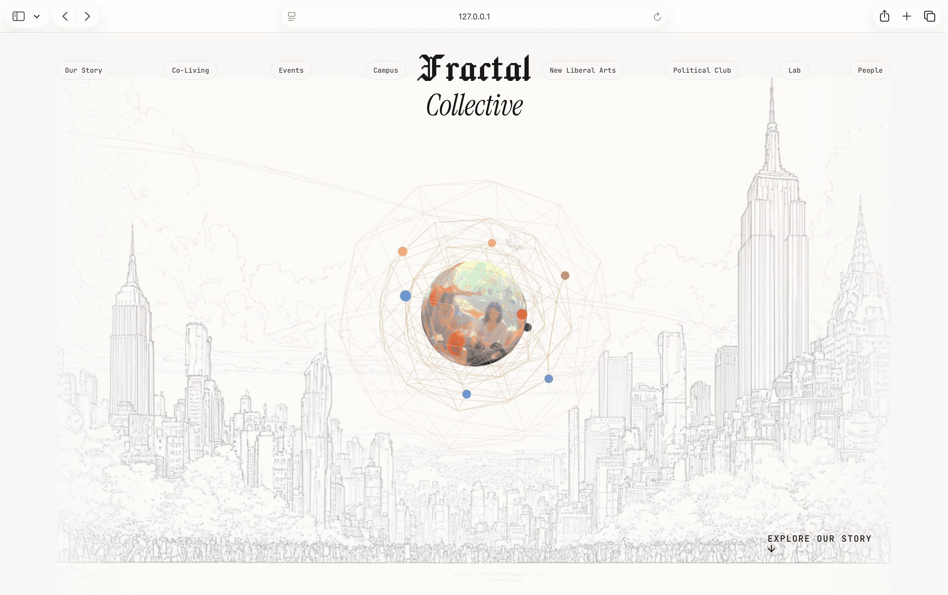
I wanted the navigation to feel like a mystery worth exploring while still answering a practical question: What do you seek, and how do you want to get involved? The hero needed to make a statement about the brand—something not immediately understood, but intuitively felt.
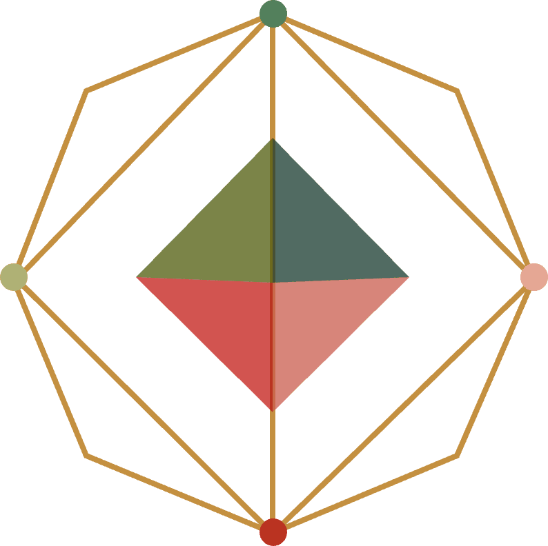
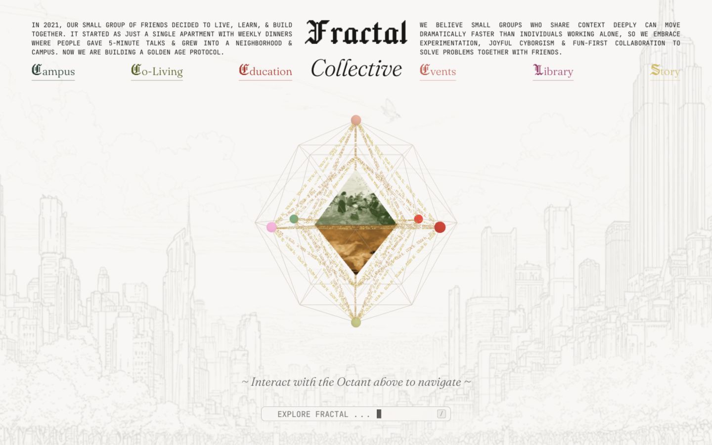
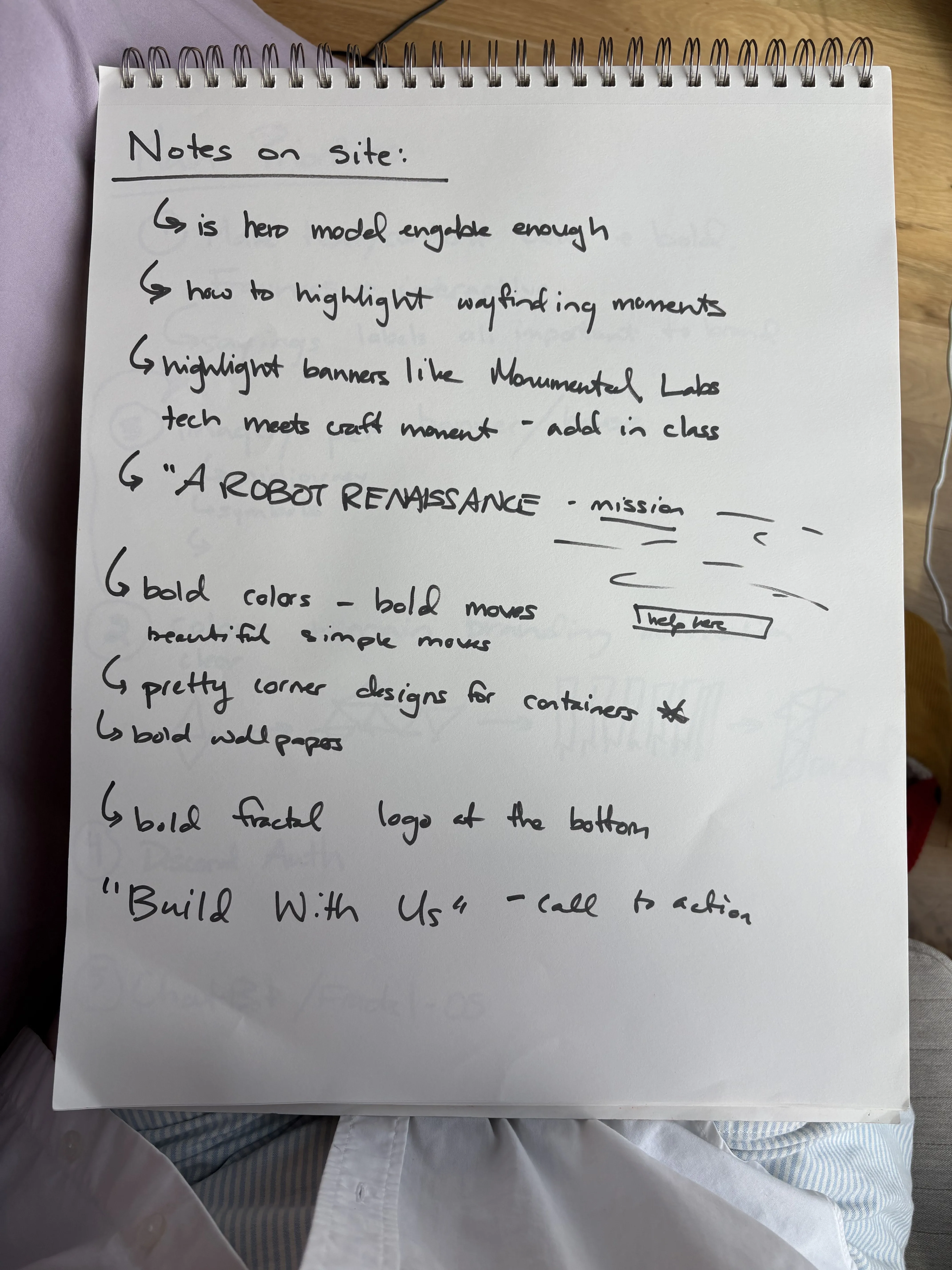
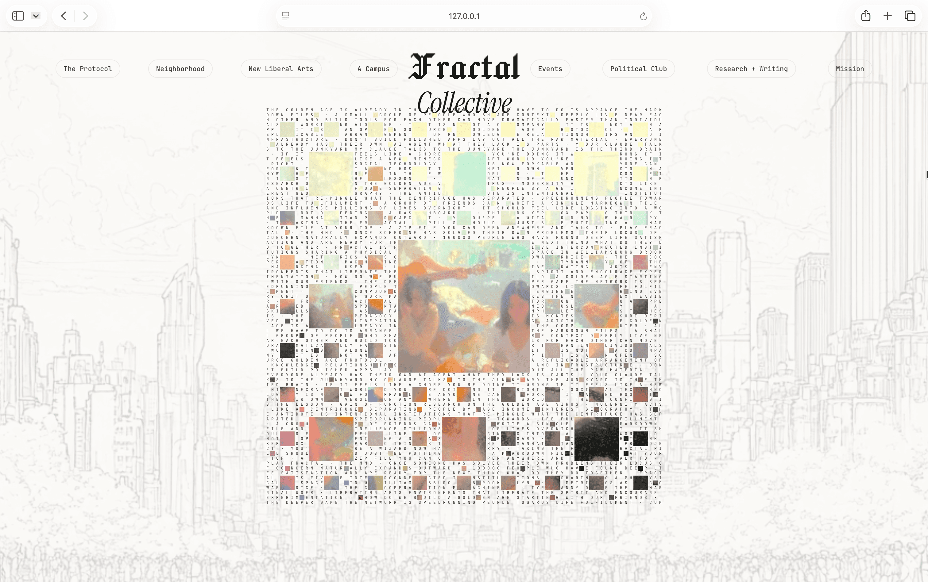
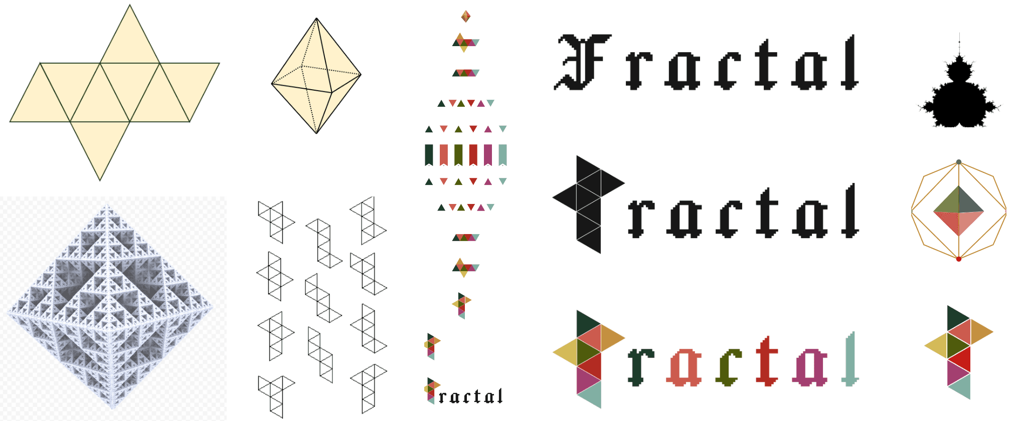
Through prototyping, the hero itself became the navigation. I explored a 3D geometry and an ASCII Sierpiński carpet, then combined their strongest ideas into an interactive octahedron. Its repeating structure became a playful nod to the name Fractal: each house helps define the whole, just as the community continues to grow by adapting a shared protocol with people at its core.
Geometry as a map
The octahedron gave each Fractal house a symbolic place within one form. Selecting a face opens its branch, then returns the user to the whole.
One protocol, repeated
Text from the Sierpiński prototype runs along the geometry’s veins, carrying the same community-centered protocol through every branch. The final experience brings both prototypes together.
The logo
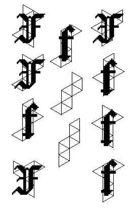
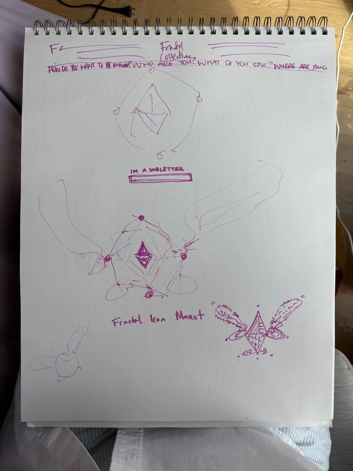
While playing with the octahedron, I noticed its geometry nested into letter-like shapes. What if the fractal at the heart of the experience could be abstracted into the F in Fractal itself? In the final animation, the hero navigation unfolds and expands to reveal banners for Fractal’s houses, comes back together, then rotates ninety degrees to resolve into the letterform and full Fractal logo.
UI and Visual Systems
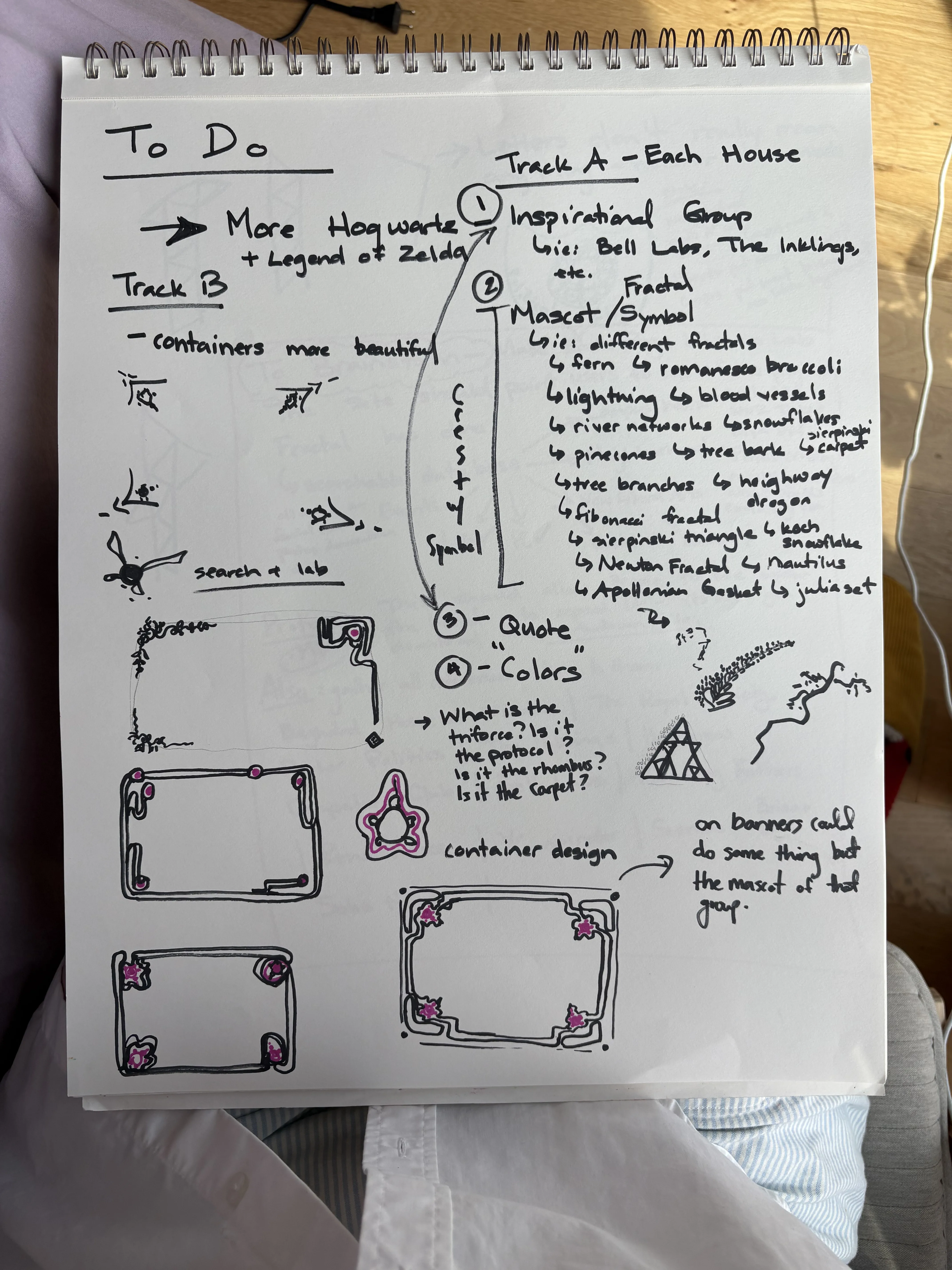
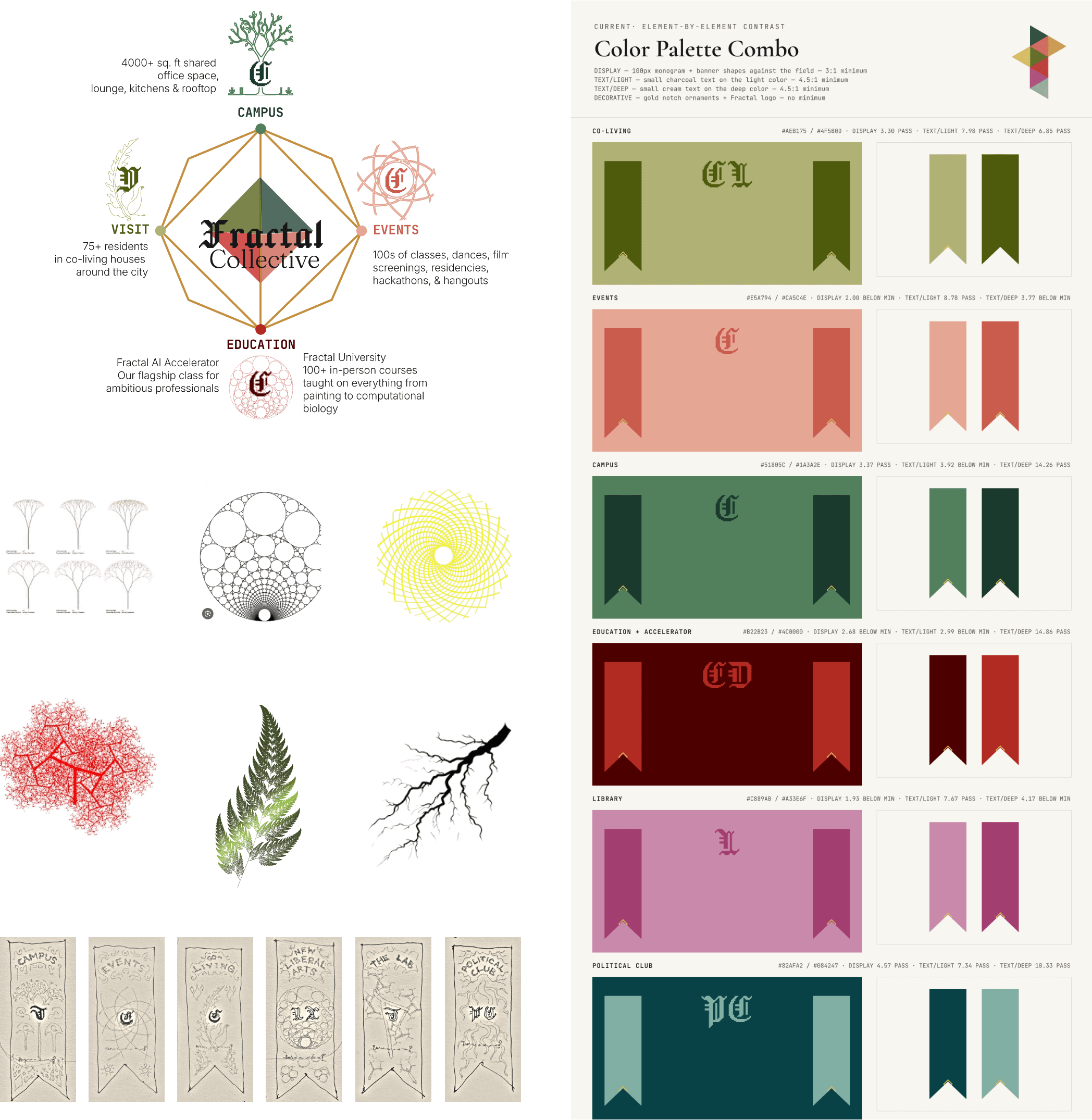
Playing with the Fractal name sparked a world of ideas, especially within the framework of its Hogwarts-like houses. What if each house had a character or mascot? Hogwarts has animals; Fractal could have fractals—playful, beautiful, and unique.
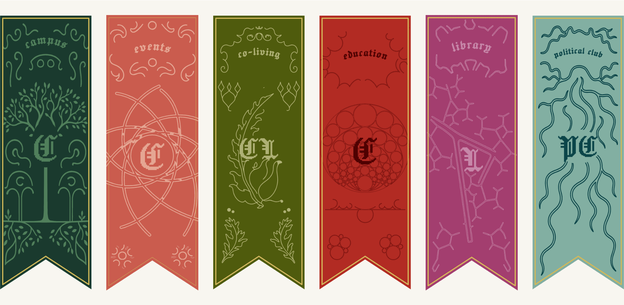
I developed these symbols into distinct identifiers for each part of the brand, then used them to adorn the site’s pages and banners with a sense of pride. Inspired by the emojis Fractal had already used to distinguish its sectors, the system gives every house an identity of its own while keeping them visibly united within one brand.
Brand assets
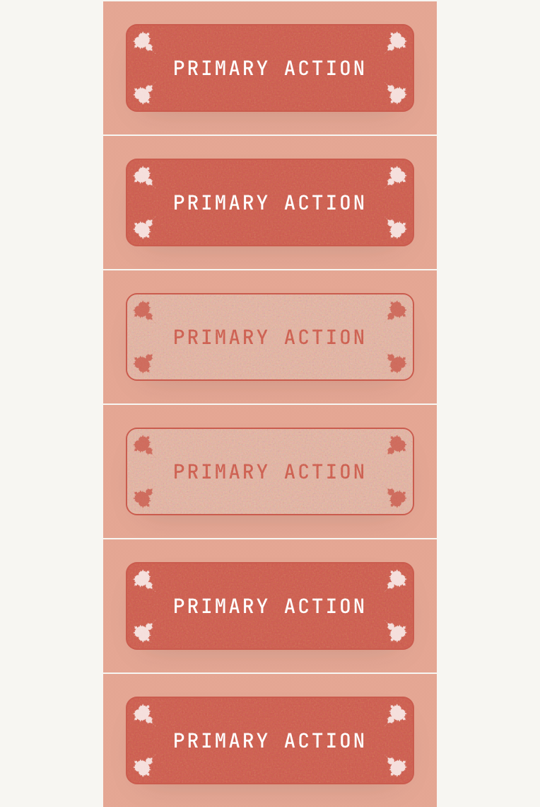
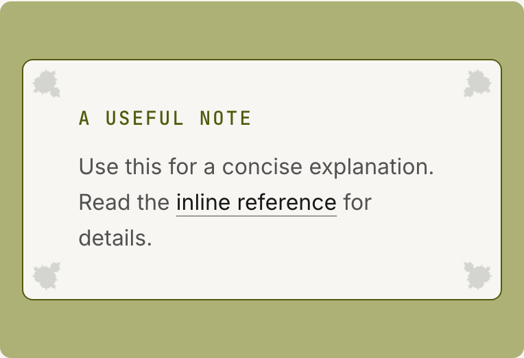
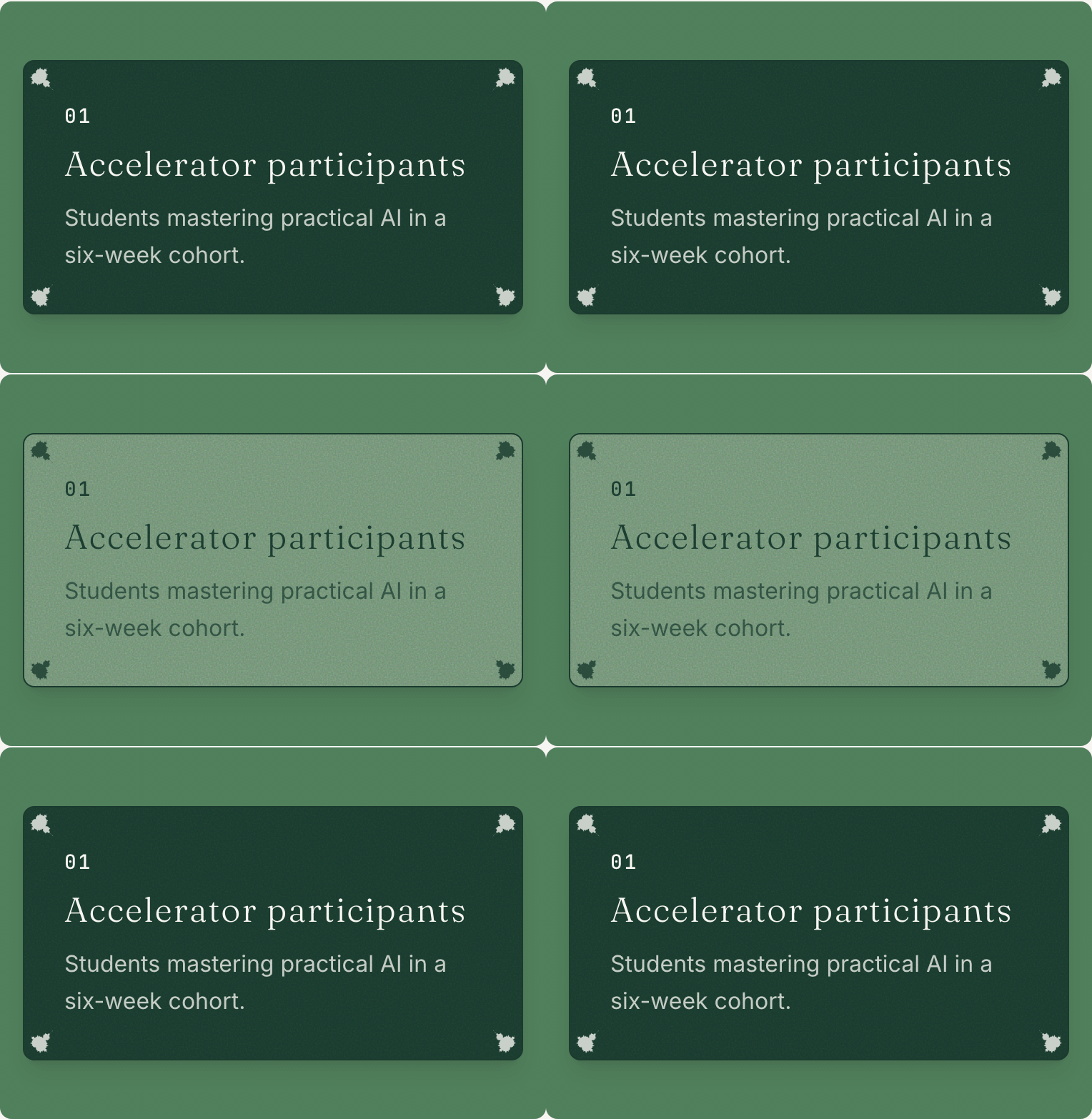
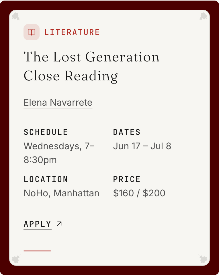
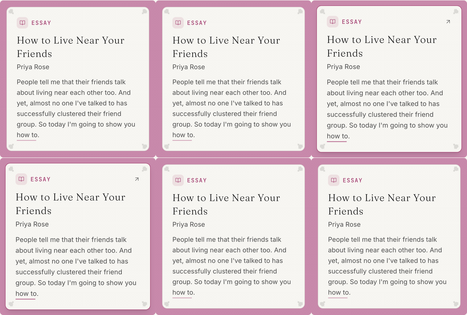
Mandelbrots adorn the corners of the containers—a nod to a beloved symbol from Fractal’s history: the “Mandelbro.”

In progress
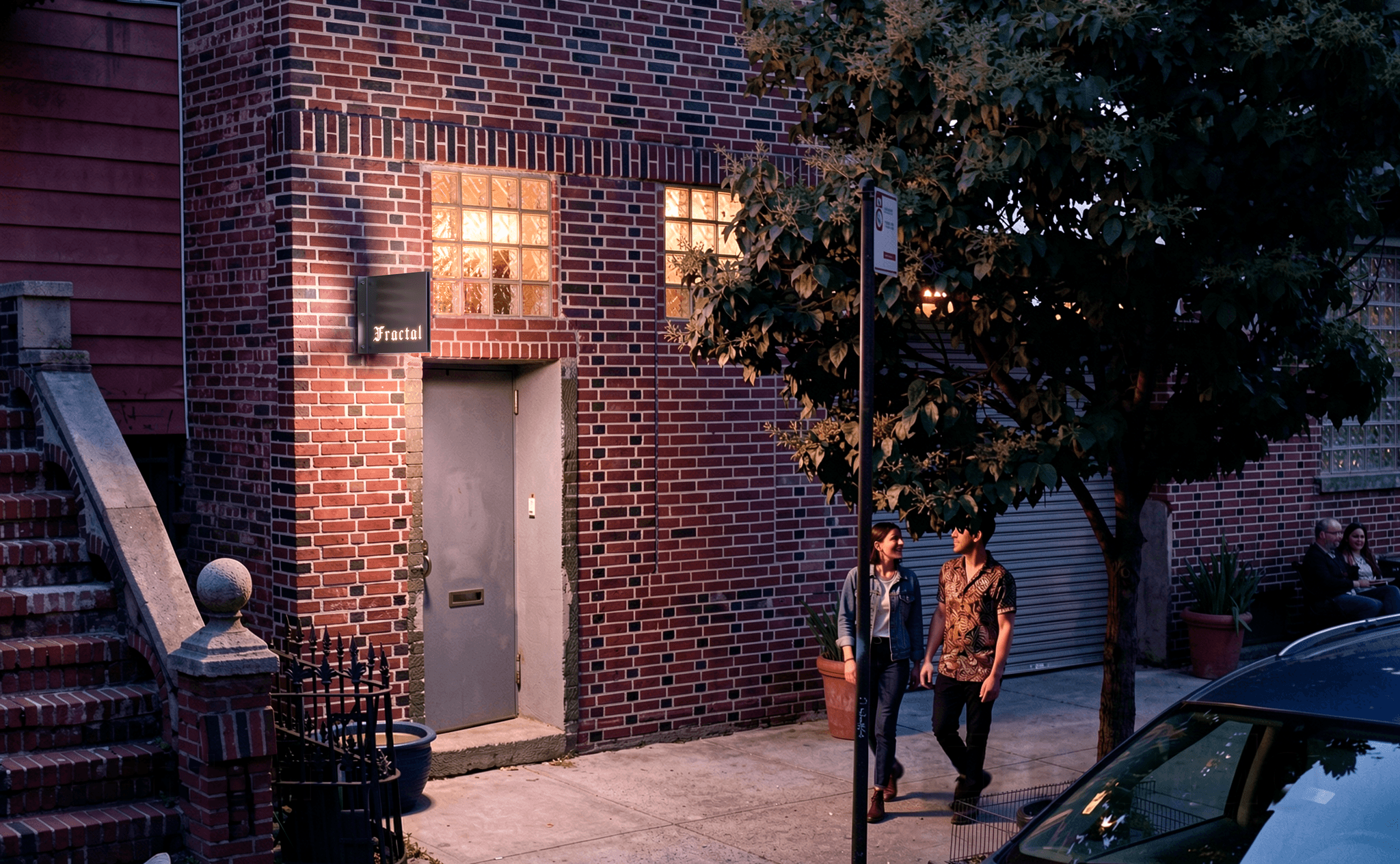
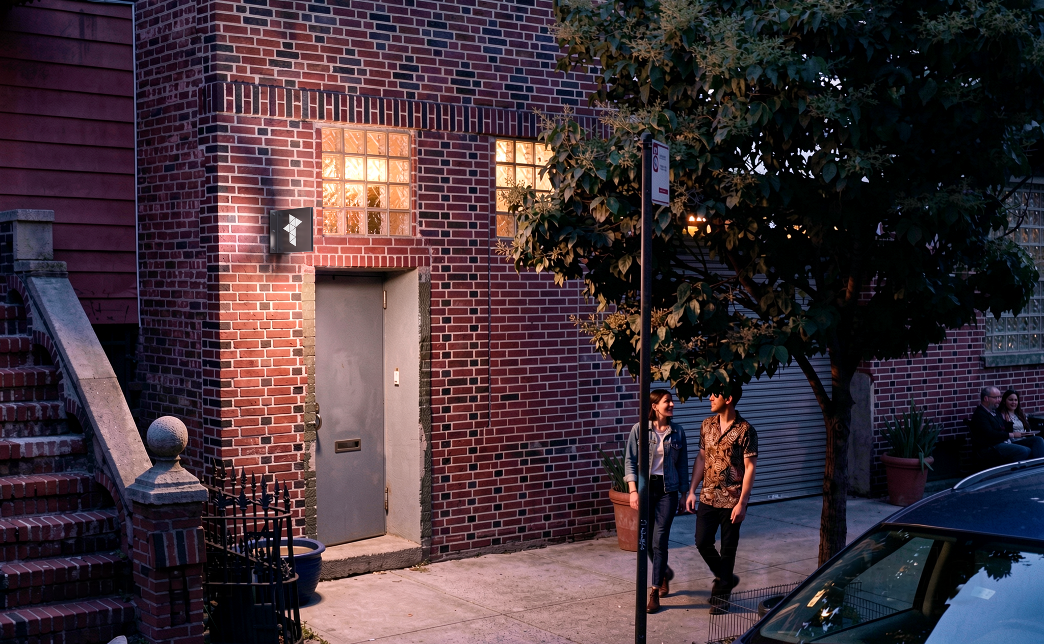
I’ve continued brand exploration for Fractal’s physical campus entryway and signage.